November 2019
Brand Strategy, Brand Identity Uplift, Stationery for a construction management & dispute resolution advisor firm based in the UK.
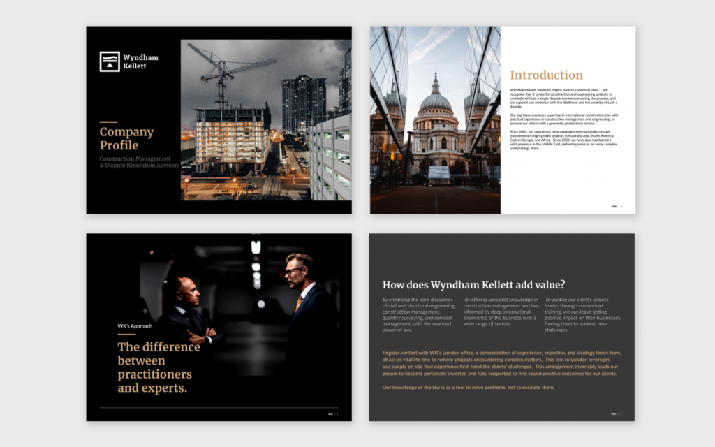
The objective from uplifting Wyndham Kellett’s identity was to create a consistent brand that is based on a clear strategy aligning WK’s business objectives with their brand.
Minimal work was made on the logo itself.
Animation by Rola El Ayoubi.
The heavy lifting was creating the visual language. Based on extensive research and the brand strategy, the brand’s image was to reflect a mature & classic look & feel, one that represents an authority in its field through dark and dramatic library of images and a limited color palette and a slab typeface as a primary font to back all this up.
To know more, check the original case study at Spearhead.